Welcome! At Inspired By, we believe creativity can spark from the simplest things—a cozy photo, a fun sketch, or a seasonal theme. Each week we share a fresh inspiration image and a coordinating sketch to get your ideas flowing. Whether you’re into cardmaking, scrapbooking, mixed media, or any type of project, you’re invited to interpret the challenge your way. There’s no right or wrong—just inspiration and creativity. We can’t wait to see what you create!
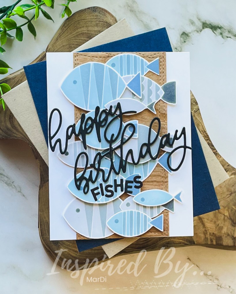
I think it’s pretty apparent that I was inspired by the photo, colors, and sketch in this week’s FISH challenge.
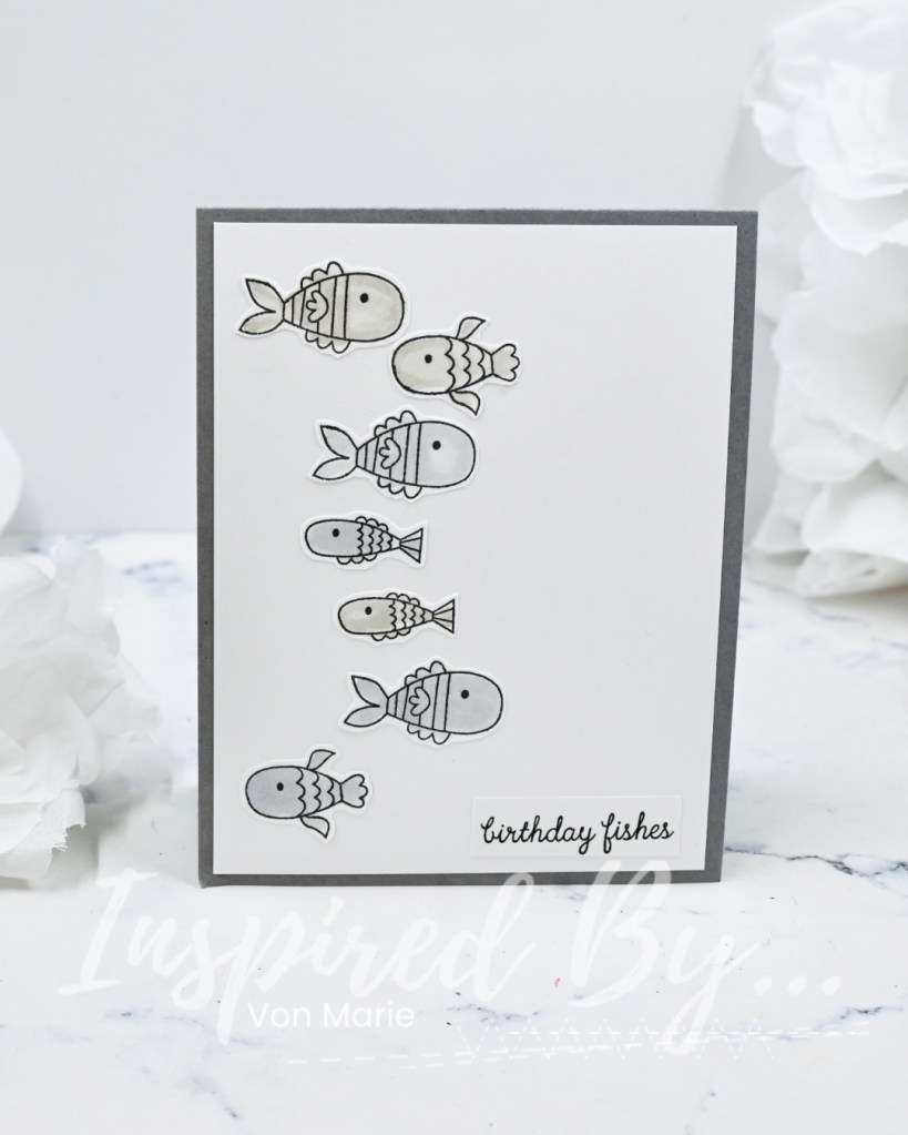
It’s always nice to find fun ways to create masculine cards. I used Concord and 9th FISH FRIENDS STENCIL PACK to create gray fish and dusty blue fish and then fussy cut them since I don’t own the dies (haven’t been able to find them). I layered them all on wood veneer paper and die cut the Happy Birthday sentiment from an Ellen Hutson die I’ve had for ages.
We hope you are inspired to join the fun this week! ~MarDi
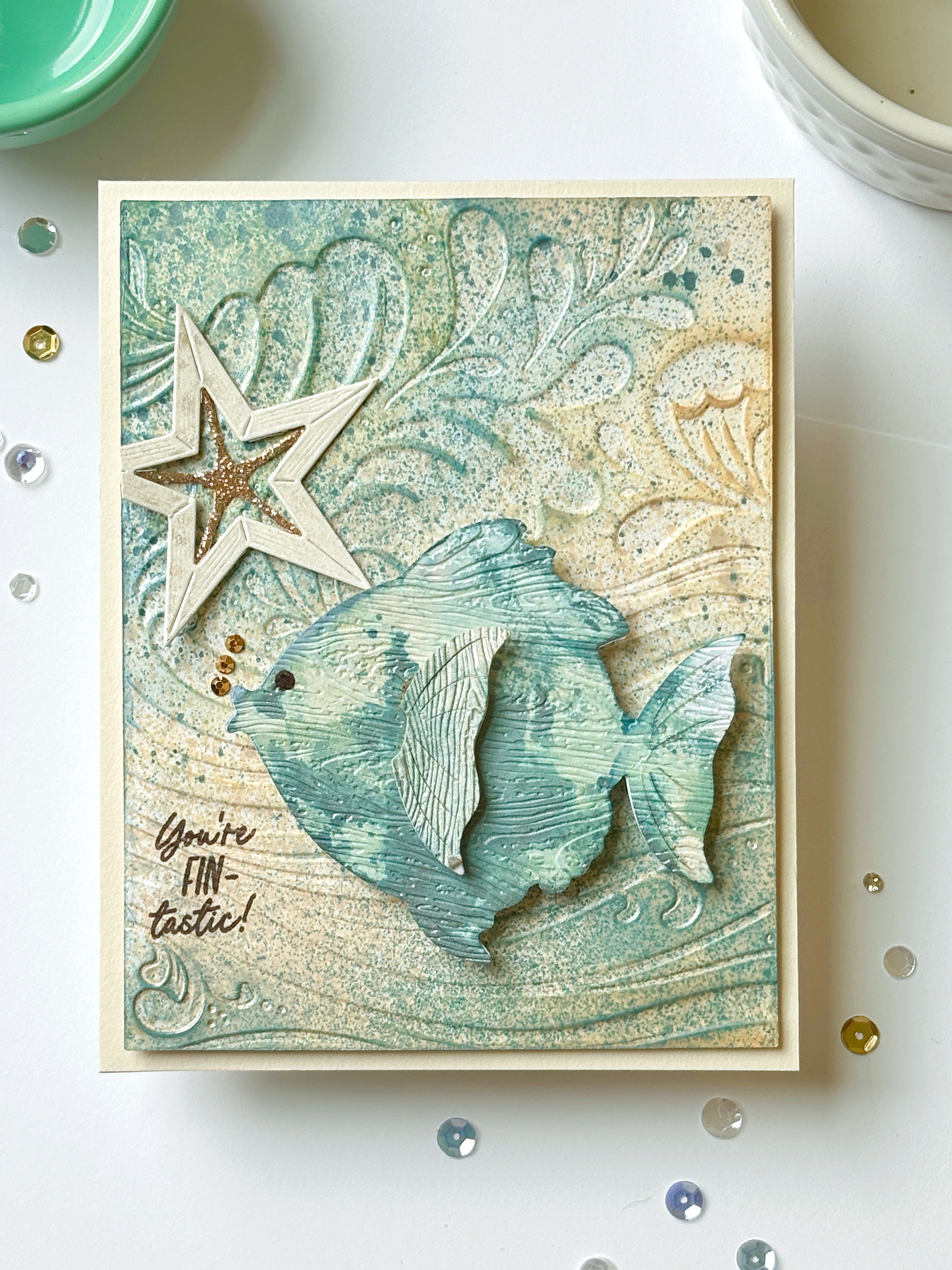
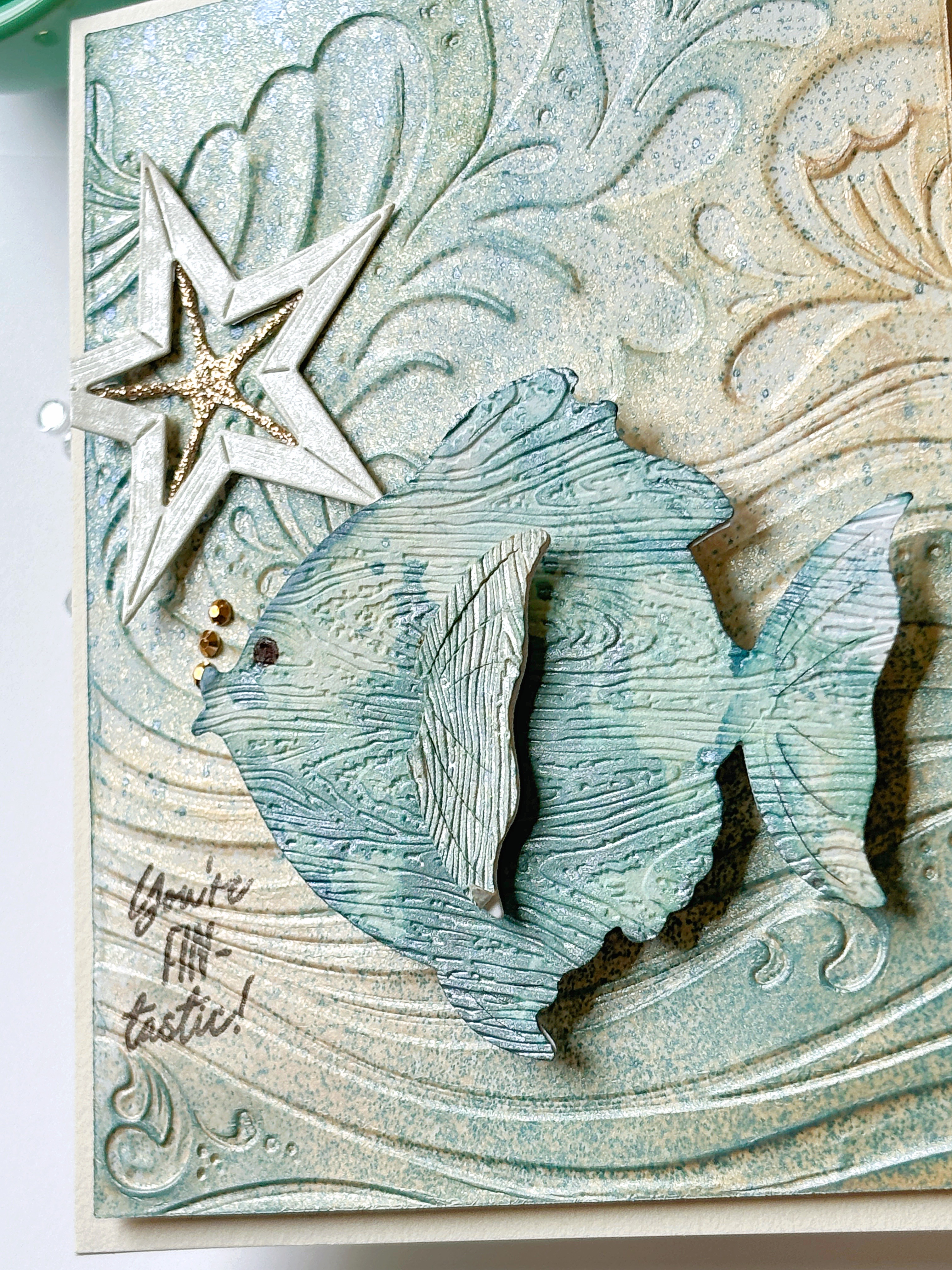
I’m late to the party this week, but I couldn’t resist posting a card inspired by the awesome wooden FISH! It gave me some time to use some new products that were perfect for this challenge.
I used The Greetery’s new Hey Honeycomb: Fish but embossed it with a woodgrain embossing folder instead of adding a crepe ball to the center. The background is made with the new Making Waves stencil and embossing folder, and Tim Holtz Distress Spray Stains in the colors Unraveled and Winter Frost…shimmery!
I added a Rustic Star: Small that was a finished piece leftover from another time! The sentiment is from Hey Honeycomb: Summer Sentiments.
Have a FIN-tastic day and we can’t wait to see how you are inspired by this week’s challenge!
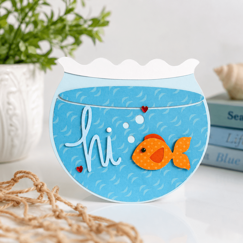
Something so cheerful about this little fish and this fun little card was inspired by the fun coastal color palette by this week’s challenge. I loved the soft blues and ocean feel and just wanted to go with the fish theme. So a fishbowl card it is.
I created a layered fishbowl design filled with soft patterned water, floating bubbles, and a sweet little orange goldfish . This card is simple and friendly~perfect for sending a quick hello to brighten someone’s day.
Please join the fun and share with us what you create with this week’s challenge.
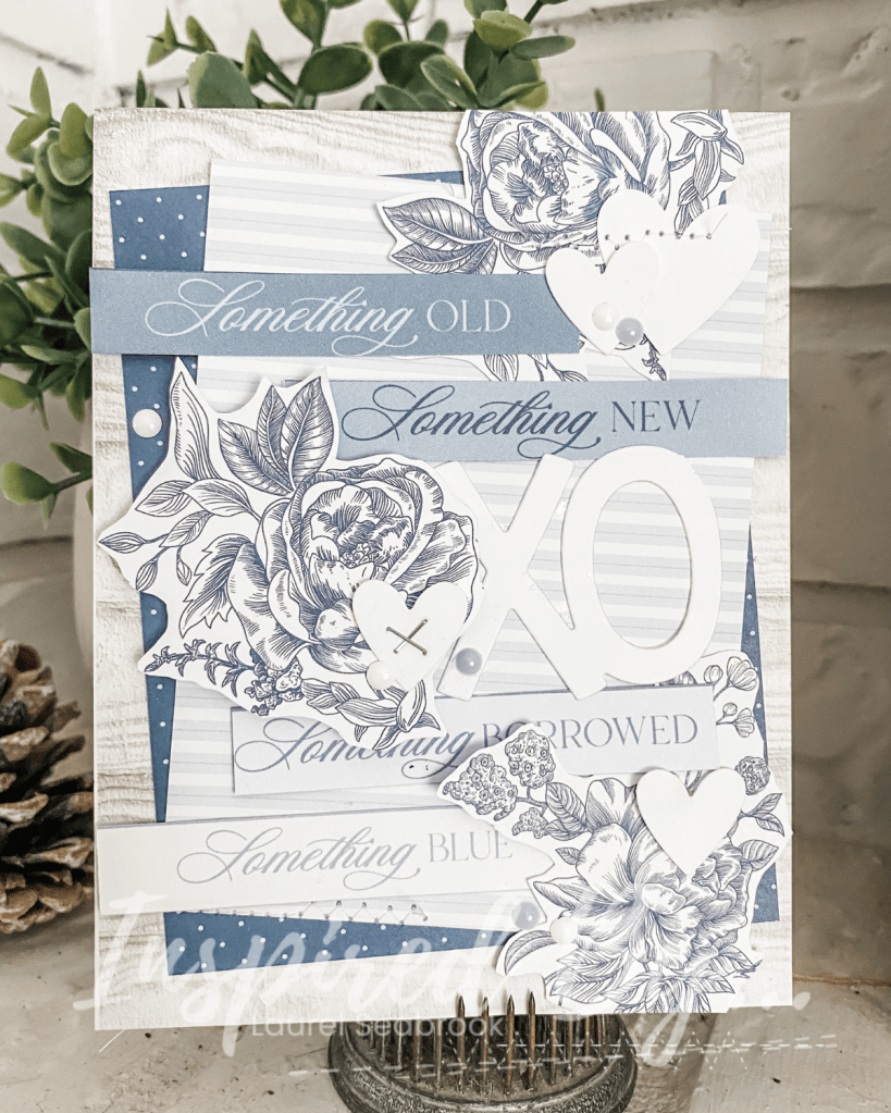
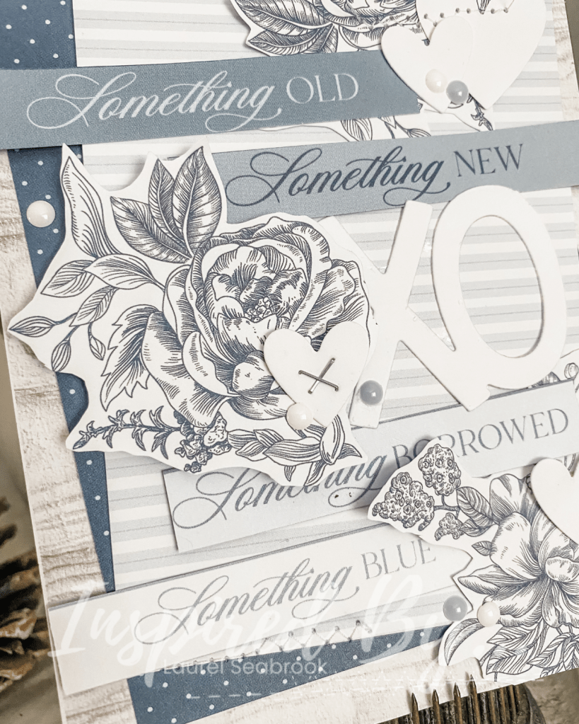
Hello, Laurel here sharing my take on this week’s challenge.
I was immediately drawn to the colors and I love a haphazard sketch so I was loosely inspired by it too. The new Save the Date collection from Echo Park is absolutely gorgeous and it worked perfectly for the color palette. The background woodgrain paper is from Stampin Up!
I started by fussy cutting the flowers from one of the pattern papers. I then layered the background papers until I was happy with the loo. Once the flowers were down (the middle on is on foam squares. I tucked the sentiments here and there simulating the sketch. The white hearts were the negative image from a heart border that I have had just waiting for the right project and this was it. The XOXO is from Lawn Fawn and then to finish it off I added some Enamel Dots.
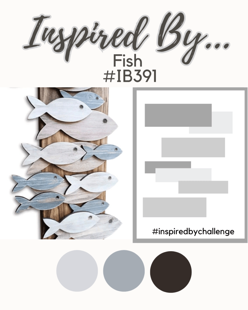
This week’s Inspired By Challenge is making a splash with a charming coastal-inspired design! With layered wooden fish in soft weathered blues, driftwood-inspired neutrals, and warm natural wood tones, this inspiration photo captures the relaxed feeling of a seaside retreat. Whether you love beach décor or simply appreciate the clean shapes and calming colors, there’s plenty here to spark your creativity.
Will you be inspired by the fish shapes, the layered arrangement, the rustic wood textures, or the soothing palette of blue, gray, and brown? Perhaps you’ll create a nautical-themed card, a beachy scrapbook layout, a mixed-media project, or something completely unexpected. Let the image and sketch guide your imagination and see where the inspiration takes you!
Now it is your turn. We can’t wait to see your interpretation of this seaside-inspired challenge. Join us for #IB391 and don’t forget to tag your project with #inspiredbychallenge. After linking up, be sure to also share your creation in our Facebook group so everyone can enjoy and celebrate your inspiration too
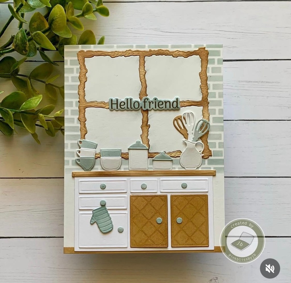
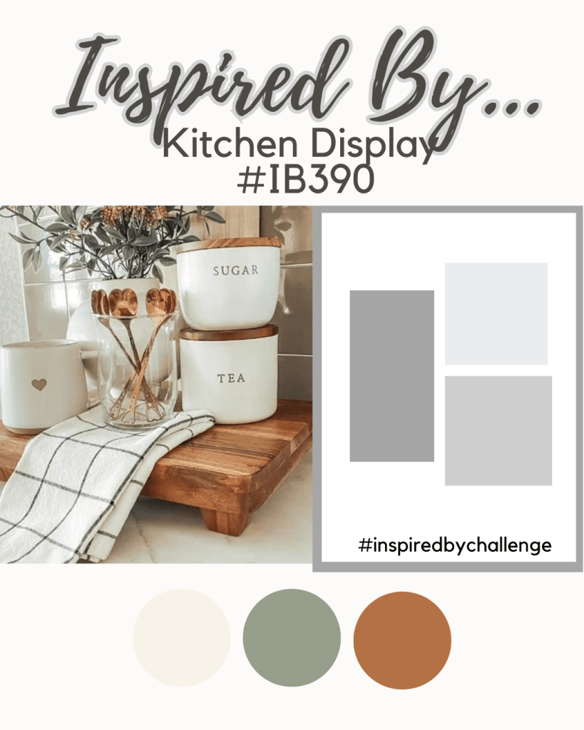
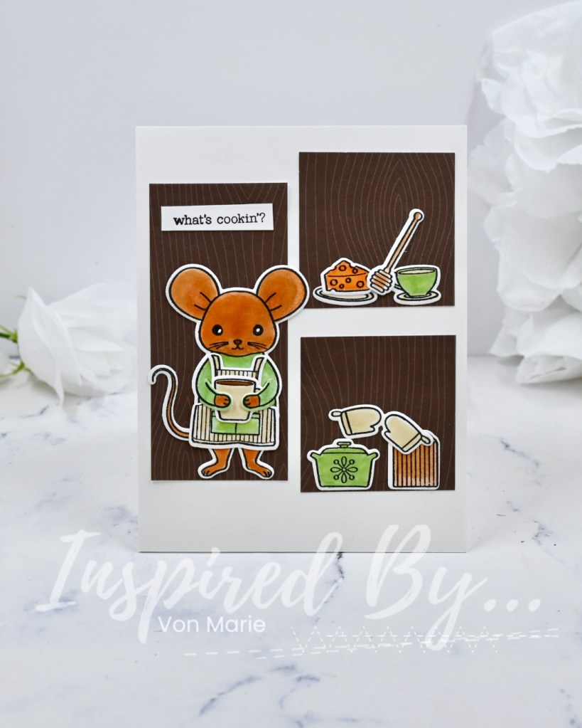
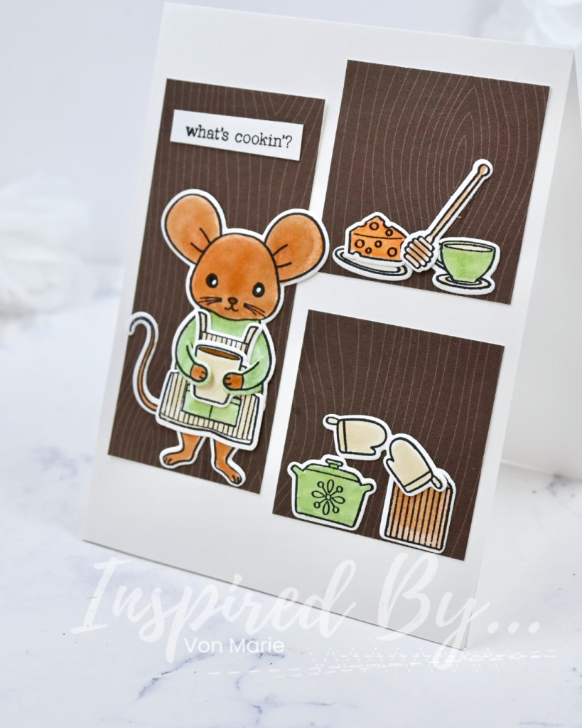
Hello everyone it’s Von Marie with you today and I’m so excited for this weeks challenge well they are all great right? This week it’s Kitchen Display #IB390. There is a fun inspirational photo and New Card Sketch.
Let’s Get Started:
I was inspired by the Kitchen Display Theme, Card Sketch, and Colors. I used a New to me stamp that was wanting to get used from Hero Arts. I have had this stamp for awhile now, so glad to use it. This stamp and cut is called What’s Cookin? I stamped my images onto white cardstock and stamped them with Memento Tuxedo black ink. I colored my images with my Copic Markers. I tried to focus and just use colors shown on the inspiration photo but I just had to use orange on the cheese. LOL. I then used the dies to cut everything out for me except for the sentiment I stamped that and cut it using my paper trimmer.
I found some Lawn Fawn woodgrain pattern paper in my stash I think it’s from into the woods? So, I cut it according to the card sketch. The What’s Cookin? die set has a die to have the mouse hold things so I loved glueing the apron and adding a big cuppa coffee in its hands. I used my white gel pen for eyes on my mouse and everything was glued to a A2 card base 4 1/4 x 5 1/2.
Now it’s your turn!
You still have time to join this challenge. Simply add your card to the Ininkz Party that’s at the bottom of the first day of the challenge. You can choose the theme or card sketch or both. Have fun!!!
Don’t forget to tag inspired_by_challenge on the socials. #inspiredbychallenges and post in our FB Group.
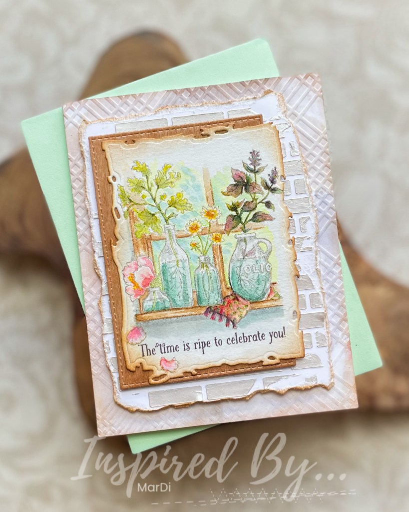
Kitchen Display is our theme this week and it was a great opportunity for me to pull out the wonderful “Go Wild”set from Power Poppy and water color my kitchen window scene with Distress inks and Catherine Pooler inks.
I confess that I had a very slow start with this one. I really didn’t have a direction, just some wood veneer paper and a textured brick background panel in may stash that I knew I wanted to use in some way. The muted colors had me stumped but I think I found a good compromise by using the wood, brick, and greenish gray panel for the background to my focal piece.
It’s not called a “challenge” for nothing. This really was challenging for me but that’s a good thing, right? When I told my doctor I was retiring last year, he asked me what I was going to do to keep my mind sharp. I told him not to worry about that, I had it covered.
We hope you’re inspired to join us this week. We would love to see how you’re inspired by Kitchen Display. ~MarDi